Legal and Ethical - J-Rock Fest
The graphics design work and forms of advertisement follows the rules that the ASA codes have set out. My campaign/planned event follows the rules and are only concerned about the following:
- Compliance
- Recognition of marketing communications
- Harm and offence
- Database practice
- Alcohol
Other codes that are not on the list is followed but they are not of a concern in terms of the type of event I have planned out. Considering that it is a music festival type event, it will not have anything on Misleading Advertisement, Political Advertisement, any sales promotions, distance selling, Environmental claims, Medicines, medical devices, health-related products and beauty products, Health concerns, Financial products and any form of gambling.
The designs I have created does not require any form of images which are copyrighted and/or owned by a specific group. Each design is made with original and owned assets so I have no need to consider anything concering copyright.
Friday, 27 November 2015
LO3: Presentation Feedback and Questionnaire
Survey Responses:
What could be improved or changed on my logo?
- Maybe tilt the J round slightly or try and make it more clear that it's a J. Perfect otherwise.
- I think that the logo is really good, I think the only thing that could be changed is the first letter to be more clear maybe, I thought it looked like an S? looks good though
-
Does the graphic design I have created appeal to the audience I am trying to aim towards? Is it appropriate for the demographic I have decided on?
- Yes because it's quite simple, quite professional and suitable for the age range.. Idea- try putting the date and time where the website is or on the side of the ticket where the barcode is because I think the block of colour of the box where the date and time is ruins the style slightly.
- Yes I think it suits the audience, looks 'rocky' and appropriate for the audience, its not very feminine though.
-
With the genre I have based my work on, do you think that the design reflects the genre?
- I think it does because it fits the house style and conventions of a rock festival, using the appropriate colours.
- I would say ROCK because of the colours used and the style reflects that genre.
-
If the graphic design was available and can be bought, would you buy it or would you not? What would your reason be for doing either?
- I wouldn't buy the t-shirt as it seems quite masculine and wouldn't be suitable for me. However purchasing the logo on a key ring or something, I think would be interesting.
- I think that it looks professional and something that I would be interested in if I was a fan of what genre.
-
Did I deliver my presentation well in terms of being able to explain what I have a done and planning to do?
- I think the presentation explains enough in detail about your festival and states some reasons on why you pick certain choices.
- I think that the presentation was good, however you could have added more logo ideas i.e other options
-
Survey Analysis:
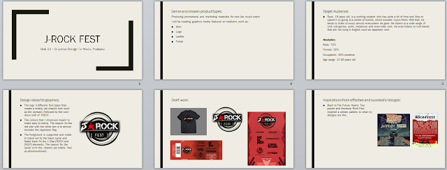
- The logo seems to have a slight problem with the 'J' part of the J-Rock section appearing like an S or something other than a J. This will need to be omitted.
- My design choices are apparently appropriate for the demographic I have chosen. Some elements such as trying to appeal to the female portion of the audience and the design in general seems to be a little off putting in that case. I will most likely change the design to accommodate that partially in a way, without getting rid or overlapping the original feeling of the graphic design.
- The colours and design choices I have made apparently fit the Rock genre. However, some of the designs do have some need for clarity.
- Certain merchandise (such as the shirt) doesn't seem to appeal well with a female audience but they would rather have something smaller in size such as a key ring. Although, others are still interested in buying the merchandise with the graphics design.
- The presentation was received quite well as I managed to deliver the appropriate and correct information that I needed to in terms of explaining my chosen genre, theme and choice of design.
Wednesday, 25 November 2015
Friday, 20 November 2015
LO4: Adobe Illustrator Technical Learning
Adobe Illustrator:
Illustrator is a vector based graphics editor which is a part of several other media manipulation programs. Quite similar to one of an existing graphics editor in the same branding, Photoshop seems to have some sort of influence on the type of toolsets and processes there is in Illustrator. However, the difference is that Photoshop is mainly an image manipulation program compared to Illustrator which is a graphics designing tool. Adobe Illustrator is available in both Windows OS and Mac OS X.
Key Terms:
Bleed -
Print bleed acts as a section that will be a frame for the elements within that frame. During printing, this area will usually be cut and will be kept white.
Raster -
A graphic that loses quality when stretched. Lossy image quality.
Vector -
A graphic that doesn't lose it's original quality when warped and manipulated. Absolutely smoothed corners, lines and surfaces. Lossless image quality.
Image formats:
.png - Portable Network Graphic
72 DPI based image that keeps it quality as much as possible. Lossless file.
.jpeg - Joint Photographic Experts Group (Image)
Mainly for photographs - Lossy file.
.tiff - Tagged Image File Format
Printing format. Most likely due to enlargement (300 DPI). Lossless file.
.eps - Encapsulated Post Script
Extreme image enlargement, made for printing on larger forms of mediums such as banners on a bus. Absolute lossless file.
Progress/Actions:
Subscribe to:
Comments (Atom)


