Thursday, 10 December 2015

LO2: Task 2 - Brief and Imaginary Entity

Brief:
Producing promotional and marketing materials for new live music event.
I will be creating graphics media featured on mediums such as:
Shirt
Logo
Leaflet
Ticket

Imaginary Entity:
Ryan, 19 years old, is a working student who has quite a bit of time and likes to spend it on going to a series 
of events, which includes music fests. With that, he tends to listen to music almost everywhere he goes. He 
listens to a wide range of rock sub genres: punk, metalcore and even indie rock. He even listens to rock bands 
that are not sung in English such as Japanese rock.

Analytics: 

Male: 70% 

Female: 30% 

Occupation: 60% students 

Age range: 17-26 years old


LO4: Production Plan


The above production plan will have me work on drafts for the first 2 weeks in which where I begin to finalize the designs. I will however, work on drafts and finalizing during the 3rd to 5th weeks. I will be gathering feedback during the end of finalizing designs and the launch date will be 2 weeks prior to the festival launch.


Sunday, 6 December 2015

LO4: Task 4 - Budget

Budget necessary for certain things such as equipment, software and printing costs:

Printing services: (http://www.vistaprint.co.uk/t-shirts.aspx?pfid=372&txi=15176&xnid=TopNav_Men%27s+T-Shirts+(linked+item)_T-Shirts_Custom+Clothing_All+Products&xnav=TopNav) - Specific, Merchandise (T-Shirts)

(http://www.vistaprint.co.uk/) - General Print Media

Starting value is around £5.35 per shirt (Basic). There are the 2 other variant (SignatureSoft and Long Sleeve) which are priced at £8.03 per shirt. These prices are the same for the Men's, Women's and Kids' t-shirts size types.


Software: (http://www.adobe.com/uk/products/catalog/software._sl_id-contentfilter_sl_catalog_sl_software_sl_mostpopular_uk.html)

Adobe Illustrator and Adobe Photoshop (Both costs £17.15 per month licensing which totals to £34.30 per month)


Pricing/Budgeting:


Friday, 27 November 2015

LO4: Legal and Ethical

Legal and Ethical - J-Rock Fest

The graphics design work and forms of advertisement follows the rules that the ASA codes have set out. My campaign/planned event follows the rules and are only concerned about the following:

- Compliance
- Recognition of marketing communications
- Harm and offence
- Database practice
- Alcohol

Other codes that are not on the list is followed but they are not of a concern in terms of the type of event I have planned out. Considering that it is a music festival type event, it will not have anything on Misleading Advertisement, Political Advertisement, any sales promotions, distance selling, Environmental claims, Medicines, medical devices, health-related products and beauty products, Health concerns, Financial products and any form of gambling. 

The designs I have created does not require any form of images which are copyrighted and/or owned by a specific group. Each design is made with original and owned assets so I have no need to consider anything concering copyright. 

LO3: Presentation Evidence


LO3: Presentation Feedback and Questionnaire

Survey Responses:

What could be improved or changed on my logo?
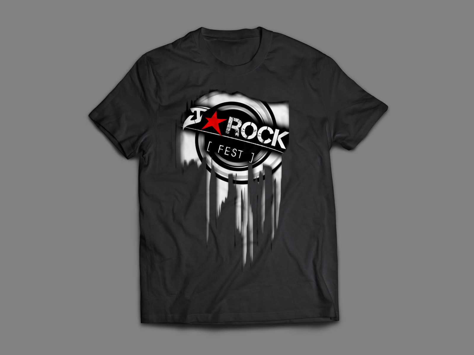
- Maybe tilt the J round slightly or try and make it more clear that it's a J. Perfect otherwise.
- I think that the logo is really good, I think the only thing that could be changed is the first letter to be more clear maybe, I thought it looked like an S? looks good though
-

Does the graphic design I have created appeal to the audience I am trying to aim towards? Is it appropriate for the demographic I have decided on?
- Yes because it's quite simple, quite professional and suitable for the age range.. Idea- try putting the date and time where the website is or on the side of the ticket where the barcode is because I think the block of colour of the box where the date and time is ruins the style slightly.
- Yes I think it suits the audience, looks 'rocky' and appropriate for the audience, its not very feminine though.
-

With the genre I have based my work on, do you think that the design reflects the genre?
- I think it does because it fits the house style and conventions of a rock festival, using the appropriate colours.
- I would say ROCK because of the colours used and the style reflects that genre.
-

If the graphic design was available and can be bought, would you buy it or would you not? What would your reason be for doing either?
- I wouldn't buy the t-shirt as it seems quite masculine and wouldn't be suitable for me. However purchasing the logo on a key ring or something, I think would be interesting.
- I think that it looks professional and something that I would be interested in if I was a fan of what genre.
-

Did I deliver my presentation well in terms of being able to explain what I have a done and planning to do?
- I think the presentation explains enough in detail about your festival and states some reasons on why you pick certain choices.
- I think that the presentation was good, however you could have added more logo ideas i.e other options
-

Survey Analysis:
- The logo seems to have a slight problem with the 'J' part of the J-Rock section appearing like an S or something other than a J. This will need to be omitted.

- My design choices are apparently appropriate for the demographic I have chosen. Some elements such as trying to appeal to the female portion of the audience and the design in general seems to be a little off putting in that case. I will most likely change the design to accommodate that partially in a way, without getting rid or overlapping the original feeling of the graphic design.

- The colours and design choices I have made apparently fit the Rock genre. However, some of the designs do have some need for clarity.

- Certain merchandise (such as the shirt) doesn't seem to appeal well with a female audience but they would rather have something smaller in size such as a key ring. Although, others are still interested in buying the merchandise with the graphics design.

- The presentation was received quite well as I managed to deliver the appropriate and correct information that I needed to in terms of explaining my chosen genre, theme and choice of design.