


The purpose of the of the graphics for the event is to promote Leeds Festival 2015. This is made evident through the text used throughout the graphics.
B) Format
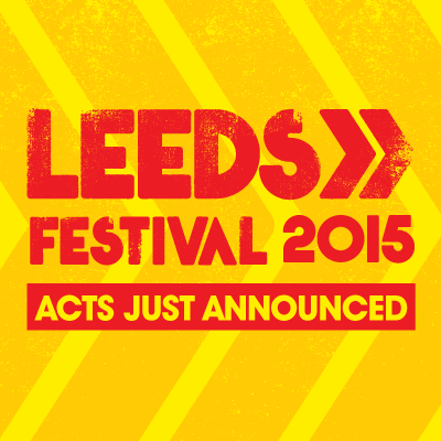
There are 5 different formats that are shown and each have the same purpose but have slightly different ways of conveying it. The poster displays all of te artists that will playing at the festival whereas the logo displays the event name and seemingly displays a slightly chaotic look but at the same, somehow orderly because of how the design has been made.
C) Content
The content shown for each format is completely different. The poster and the ticket is probably the only formats that share some form of similarity in terms of what content there is to feature.
D) Style
The style featured has a chaotic look due to the way the font looks and the way how the background appears like it has a lot of noise. The red and yellow colours have a contrast with each other which makes the content and layout even more clearly than possible.
E) Layout
The layout of the graphics are very clear and display all of the content as much as possible to help convey the type of promotion it is trying to get across. The banner features a red and yellow contrast with each other having the opposite colours to each other.
F) Target Audience
G) Regulatory Bodies
The ASA is the regulatory body.
No comments:
Post a Comment