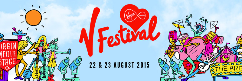


The purpose of the featured graphics design media is to promote the V Festival. This will feature local artist and popular artist to provide a wide spectrum of music genres and available content at the festival.
B) Format
There are 5 different formats which are usually the most commonly used: tickets, poster, t-shirt, logo and a banner. These formats just as other formats are made for, have different content, layout and sometimes style but all have the same purpose and are just trying to communicate it in a different way.
C) Content
The content featured is mostly seen on the poster since it features all of the artists. The t-shirt is the same as it displays all the artists that are at the festival on the back. The poster advertising the artists are categorised and are clearly shown due to the way the layout has been made. The logo is very much made obvious throughout all of the formats in a way so that it is easily recognizable and people will pretty much understand the purpose of the promotional material.
D) Style
The style has certain features such as using bright colours and colours that compliment each other. Fonts and text sizes show the more distiguished artists but at the same time, it doesn't seem to leave out the more smaller artists but this is a clear use of promotional power where people are easily dragged in by the more famous artists but go to the festival and hear all of the artists and enjoy the whole event anyway. The logo has quite a stylised font reflecting the Virgin Media service font style which in turn could help identify the promotional material quickly.
E) Layout
F) Target Audience
The target audience for the promotion is most likely everyone because of the type of genres there are available. Age wise though, it's quite different for each of the artists that will be playing such as Justin Timberlake and Ed Sheeran having different target audiences but with some similarities.G) Regulatory Bodies
No comments:
Post a Comment