Survey Responses:
What could be improved or changed on my logo?
- Maybe tilt the J round slightly or try and make it more clear that it's a J. Perfect otherwise.
- I think that the logo is really good, I think the only thing that could be changed is the first letter to be more clear maybe, I thought it looked like an S? looks good though
-
Does the graphic design I have created appeal to the audience I am trying to aim towards? Is it appropriate for the demographic I have decided on?
- Yes because it's quite simple, quite professional and suitable for the age range.. Idea- try putting the date and time where the website is or on the side of the ticket where the barcode is because I think the block of colour of the box where the date and time is ruins the style slightly.
- Yes I think it suits the audience, looks 'rocky' and appropriate for the audience, its not very feminine though.
-
With the genre I have based my work on, do you think that the design reflects the genre?
- I think it does because it fits the house style and conventions of a rock festival, using the appropriate colours.
- I would say ROCK because of the colours used and the style reflects that genre.
-
If the graphic design was available and can be bought, would you buy it or would you not? What would your reason be for doing either?
- I wouldn't buy the t-shirt as it seems quite masculine and wouldn't be suitable for me. However purchasing the logo on a key ring or something, I think would be interesting.
- I think that it looks professional and something that I would be interested in if I was a fan of what genre.
-
Did I deliver my presentation well in terms of being able to explain what I have a done and planning to do?
- I think the presentation explains enough in detail about your festival and states some reasons on why you pick certain choices.
- I think that the presentation was good, however you could have added more logo ideas i.e other options
-
Survey Analysis:
- The logo seems to have a slight problem with the 'J' part of the J-Rock section appearing like an S or something other than a J. This will need to be omitted.
- My design choices are apparently appropriate for the demographic I have chosen. Some elements such as trying to appeal to the female portion of the audience and the design in general seems to be a little off putting in that case. I will most likely change the design to accommodate that partially in a way, without getting rid or overlapping the original feeling of the graphic design.
- The colours and design choices I have made apparently fit the Rock genre. However, some of the designs do have some need for clarity.
- Certain merchandise (such as the shirt) doesn't seem to appeal well with a female audience but they would rather have something smaller in size such as a key ring. Although, others are still interested in buying the merchandise with the graphics design.
- The presentation was received quite well as I managed to deliver the appropriate and correct information that I needed to in terms of explaining my chosen genre, theme and choice of design.
Friday, 27 November 2015
Wednesday, 25 November 2015


Friday, 20 November 2015
LO4: Adobe Illustrator Technical Learning
Illustrator is a vector based graphics editor which is a part of several other media manipulation programs. Quite similar to one of an existing graphics editor in the same branding, Photoshop seems to have some sort of influence on the type of toolsets and processes there is in Illustrator. However, the difference is that Photoshop is mainly an image manipulation program compared to Illustrator which is a graphics designing tool. Adobe Illustrator is available in both Windows OS and Mac OS X.
Key Terms:
Bleed -
Print bleed acts as a section that will be a frame for the elements within that frame. During printing, this area will usually be cut and will be kept white.
Raster -
A graphic that loses quality when stretched. Lossy image quality.
Vector -
A graphic that doesn't lose it's original quality when warped and manipulated. Absolutely smoothed corners, lines and surfaces. Lossless image quality.
Image formats:
.png - Portable Network Graphic
72 DPI based image that keeps it quality as much as possible. Lossless file.
.jpeg - Joint Photographic Experts Group (Image)
Mainly for photographs - Lossy file.
.tiff - Tagged Image File Format
Printing format. Most likely due to enlargement (300 DPI). Lossless file.
.eps - Encapsulated Post Script
Extreme image enlargement, made for printing on larger forms of mediums such as banners on a bus. Absolute lossless file.
Progress/Actions:


Monday, 19 October 2015
LO1: Task 1 - T In The Park


The purpose of the graphic media created above is to promote the T In The Park music festival. Just as any other event does, promotion through graphic mediums can prove quite effective, depending whether a design has been laid out well and has a certain style to it.
B) Format
There are 5 formats to the promotional material for T In The Park: Tickets, logo, merchandise, poster and a banner. Each of these as any other promotion for every event, are used to advertise the T In The Park music fest.
C) Content
The formats have different content featured on them. In general, each of the designs have the logo always present, some even have a different style for them. The poster has the information pertaining all the artists that will be playing at the music festival, the time that they will be playing at what days and what the location it will be at. The poster has several differences in terms of content compared to something like the jumper with the artists on the back. The poster features several artist names which are bigger than the other ones which catches peoples eyes more often than not since they may notice the artist and they can become more interested.
D) Style
The style of T In The Park features very bright colours, large varied fonts and thematic feel to the type of design it has. The varied fonts are most likely to represent the artists that are playing in the music fest as they each have their own font styles that represent themselves. The banner has quite an artistic style due to the way they used their logo part and incorporating it as a main focus of the banner.
E) Layout
F) Target Audience
Due to the way the designs are made and laid out, it can attract a wide range of audience and not only that, the artists featured are quite well known and are made obvious through the layout and style. Like any other music fest, these are aimed towards the local people, students and people who generally go to music fests.G) Regulatory Bodies
LO1: Task 1 - V Festival
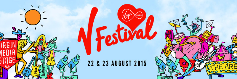


The purpose of the featured graphics design media is to promote the V Festival. This will feature local artist and popular artist to provide a wide spectrum of music genres and available content at the festival.
B) Format
There are 5 different formats which are usually the most commonly used: tickets, poster, t-shirt, logo and a banner. These formats just as other formats are made for, have different content, layout and sometimes style but all have the same purpose and are just trying to communicate it in a different way.
C) Content
The content featured is mostly seen on the poster since it features all of the artists. The t-shirt is the same as it displays all the artists that are at the festival on the back. The poster advertising the artists are categorised and are clearly shown due to the way the layout has been made. The logo is very much made obvious throughout all of the formats in a way so that it is easily recognizable and people will pretty much understand the purpose of the promotional material.
D) Style
The style has certain features such as using bright colours and colours that compliment each other. Fonts and text sizes show the more distiguished artists but at the same time, it doesn't seem to leave out the more smaller artists but this is a clear use of promotional power where people are easily dragged in by the more famous artists but go to the festival and hear all of the artists and enjoy the whole event anyway. The logo has quite a stylised font reflecting the Virgin Media service font style which in turn could help identify the promotional material quickly.
E) Layout
F) Target Audience
The target audience for the promotion is most likely everyone because of the type of genres there are available. Age wise though, it's quite different for each of the artists that will be playing such as Justin Timberlake and Ed Sheeran having different target audiences but with some similarities.G) Regulatory Bodies
LO1: Task 1 - Tramlines


The purpose of the graphics design for each of the format is for promotional material for Tramlines Festival. Each of the format have their own way of conveying the purpose of the graphics featured. Each with different layouts and content but a certain graphic is constantly present throughout all of them which in this case is the logo.
B) Format
There are 5 different formats which feature graphic design that help convey the purpose of the promotion for Tramlines Festival. These types of format are extremely common in promotional materials as they are the easiest to manage, create and design layouts and styles for.
C) Content
The content that is most prominent among the formats is on the poster which features all the artists that are going to be playing in the Tramlines Festival. The shirt features a stylised version of the logo to make it appear more themed and follows the type of event that the promotion is trying to show.
D) Style
The style featured for the Tramlines Festival follows a certain colour pallete that includes red, light blue black and white. Light blue and red contrast each other extremely well and white colours used for the text helps to split apart the colours to create a simple but stylish design, specifically for the poster. The colours white, red and black are more present in the other formats but that is due to the lack of light blue. The main reason for the poster having a light blue type colour is the fact that it is the inverse of the red prominently present across the poster. Having the complete opposite colour helps make some of the text and layout design pop out more, especially since the logo also features that use of inverse colour.
E) Layout
The layout is clean and very simple. Not getting in the way of each of the features of the graphic. The ticket format for example features very little but gets the point across in that it is a ticket for the Tramlines Festival between Friday 19th of July to Sunday 21st of July. Another example of extremely concise design is the poster; the font and text, logo and title placement, small stylised banner for the pricing and the text for the artists all are seperate and do not overlap each other. This makes it easy for the poster to get the information across.
F) Target Audience
The target audience of Tramlines Festival was targeted towards people who often go to festivals and most likely between the ages of 18-35 years of age. This is probably because of the music that is being promoted and the type of style the graphics are showing. It seems more appealing towards the younger generation of people. Considering that the festival is based in a student filled city, it's most likely promoted towards students. G) Regulatory Bodies
The regulatory body seems to be the ASA.
LO1: Task 1 - Leeds Festival

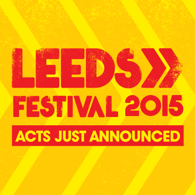


The purpose of the of the graphics for the event is to promote Leeds Festival 2015. This is made evident through the text used throughout the graphics.
B) Format
There are 5 different formats that are shown and each have the same purpose but have slightly different ways of conveying it. The poster displays all of te artists that will playing at the festival whereas the logo displays the event name and seemingly displays a slightly chaotic look but at the same, somehow orderly because of how the design has been made.
C) Content
The content shown for each format is completely different. The poster and the ticket is probably the only formats that share some form of similarity in terms of what content there is to feature.
D) Style
The style featured has a chaotic look due to the way the font looks and the way how the background appears like it has a lot of noise. The red and yellow colours have a contrast with each other which makes the content and layout even more clearly than possible.
E) Layout
The layout of the graphics are very clear and display all of the content as much as possible to help convey the type of promotion it is trying to get across. The banner features a red and yellow contrast with each other having the opposite colours to each other.
F) Target Audience
G) Regulatory Bodies
The ASA is the regulatory body.
Subscribe to:
Posts (Atom)