Thursday 10 December 2015

LO2: Task 2 - Brief and Imaginary Entity

Brief:
Producing promotional and marketing materials for new live music event.
I will be creating graphics media featured on mediums such as:
Shirt
Logo
Leaflet
Ticket

Imaginary Entity:
Ryan, 19 years old, is a working student who has quite a bit of time and likes to spend it on going to a series 
of events, which includes music fests. With that, he tends to listen to music almost everywhere he goes. He 
listens to a wide range of rock sub genres: punk, metalcore and even indie rock. He even listens to rock bands 
that are not sung in English such as Japanese rock.

Analytics: 

Male: 70% 

Female: 30% 

Occupation: 60% students 

Age range: 17-26 years old


LO4: Production Plan


The above production plan will have me work on drafts for the first 2 weeks in which where I begin to finalize the designs. I will however, work on drafts and finalizing during the 3rd to 5th weeks. I will be gathering feedback during the end of finalizing designs and the launch date will be 2 weeks prior to the festival launch.


Sunday 6 December 2015

LO4: Task 4 - Budget

Budget necessary for certain things such as equipment, software and printing costs:

Printing services: (http://www.vistaprint.co.uk/t-shirts.aspx?pfid=372&txi=15176&xnid=TopNav_Men%27s+T-Shirts+(linked+item)_T-Shirts_Custom+Clothing_All+Products&xnav=TopNav) - Specific, Merchandise (T-Shirts)

(http://www.vistaprint.co.uk/) - General Print Media

Starting value is around £5.35 per shirt (Basic). There are the 2 other variant (SignatureSoft and Long Sleeve) which are priced at £8.03 per shirt. These prices are the same for the Men's, Women's and Kids' t-shirts size types.


Software: (http://www.adobe.com/uk/products/catalog/software._sl_id-contentfilter_sl_catalog_sl_software_sl_mostpopular_uk.html)

Adobe Illustrator and Adobe Photoshop (Both costs £17.15 per month licensing which totals to £34.30 per month)


Pricing/Budgeting:


Friday 27 November 2015

LO4: Legal and Ethical

Legal and Ethical - J-Rock Fest

The graphics design work and forms of advertisement follows the rules that the ASA codes have set out. My campaign/planned event follows the rules and are only concerned about the following:

- Compliance
- Recognition of marketing communications
- Harm and offence
- Database practice
- Alcohol

Other codes that are not on the list is followed but they are not of a concern in terms of the type of event I have planned out. Considering that it is a music festival type event, it will not have anything on Misleading Advertisement, Political Advertisement, any sales promotions, distance selling, Environmental claims, Medicines, medical devices, health-related products and beauty products, Health concerns, Financial products and any form of gambling. 

The designs I have created does not require any form of images which are copyrighted and/or owned by a specific group. Each design is made with original and owned assets so I have no need to consider anything concering copyright. 

LO3: Presentation Evidence


LO3: Presentation Feedback and Questionnaire

Survey Responses:

What could be improved or changed on my logo?
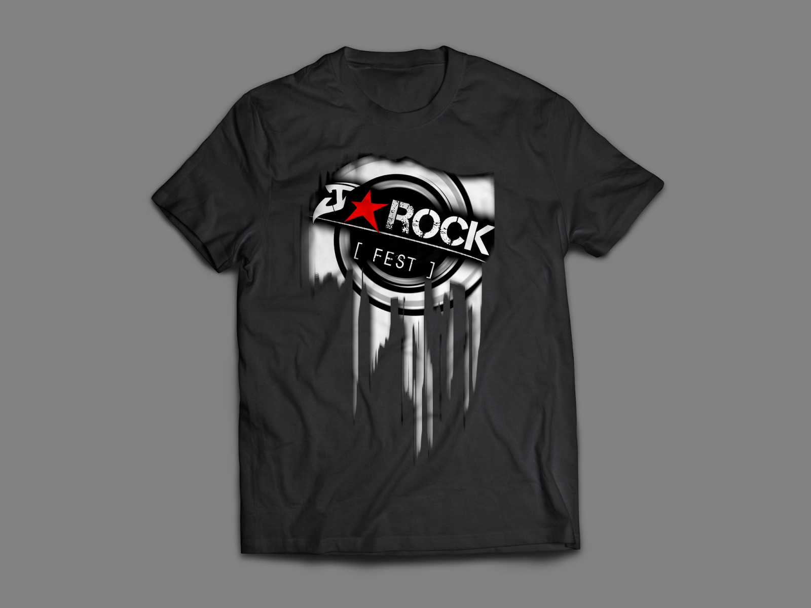
- Maybe tilt the J round slightly or try and make it more clear that it's a J. Perfect otherwise.
- I think that the logo is really good, I think the only thing that could be changed is the first letter to be more clear maybe, I thought it looked like an S? looks good though
-

Does the graphic design I have created appeal to the audience I am trying to aim towards? Is it appropriate for the demographic I have decided on?
- Yes because it's quite simple, quite professional and suitable for the age range.. Idea- try putting the date and time where the website is or on the side of the ticket where the barcode is because I think the block of colour of the box where the date and time is ruins the style slightly.
- Yes I think it suits the audience, looks 'rocky' and appropriate for the audience, its not very feminine though.
-

With the genre I have based my work on, do you think that the design reflects the genre?
- I think it does because it fits the house style and conventions of a rock festival, using the appropriate colours.
- I would say ROCK because of the colours used and the style reflects that genre.
-

If the graphic design was available and can be bought, would you buy it or would you not? What would your reason be for doing either?
- I wouldn't buy the t-shirt as it seems quite masculine and wouldn't be suitable for me. However purchasing the logo on a key ring or something, I think would be interesting.
- I think that it looks professional and something that I would be interested in if I was a fan of what genre.
-

Did I deliver my presentation well in terms of being able to explain what I have a done and planning to do?
- I think the presentation explains enough in detail about your festival and states some reasons on why you pick certain choices.
- I think that the presentation was good, however you could have added more logo ideas i.e other options
-

Survey Analysis:
- The logo seems to have a slight problem with the 'J' part of the J-Rock section appearing like an S or something other than a J. This will need to be omitted.

- My design choices are apparently appropriate for the demographic I have chosen. Some elements such as trying to appeal to the female portion of the audience and the design in general seems to be a little off putting in that case. I will most likely change the design to accommodate that partially in a way, without getting rid or overlapping the original feeling of the graphic design.

- The colours and design choices I have made apparently fit the Rock genre. However, some of the designs do have some need for clarity.

- Certain merchandise (such as the shirt) doesn't seem to appeal well with a female audience but they would rather have something smaller in size such as a key ring. Although, others are still interested in buying the merchandise with the graphics design.

- The presentation was received quite well as I managed to deliver the appropriate and correct information that I needed to in terms of explaining my chosen genre, theme and choice of design.

Friday 20 November 2015

LO4: Adobe Illustrator Technical Learning

Adobe Illustrator:
Illustrator is a vector based graphics editor which is a part of several other media manipulation programs. Quite similar to one of an existing graphics editor in the same branding, Photoshop seems to have some sort of influence on the type of toolsets and processes there is in Illustrator. However, the difference is that Photoshop is mainly an image manipulation program compared to Illustrator which is a graphics designing tool. Adobe Illustrator is available in both Windows OS and Mac OS X.

Key Terms:
Bleed -
Print bleed acts as a section that will be a frame for the elements within that frame. During printing, this area will usually be cut and will be kept white.

Raster -
A graphic that loses quality when stretched. Lossy image quality.

Vector -
A graphic that doesn't lose it's original quality when warped and manipulated. Absolutely smoothed corners, lines and surfaces. Lossless image quality.

Image formats:
.png - Portable Network Graphic
72 DPI based image that keeps it quality as much as possible. Lossless file.

.jpeg - Joint Photographic Experts Group (Image)
Mainly for photographs - Lossy file.

.tiff - Tagged Image File Format
Printing format. Most likely due to enlargement (300 DPI). Lossless file.

.eps - Encapsulated Post Script
Extreme image enlargement, made for printing on larger forms of mediums such as banners on a bus. Absolute lossless file.

Progress/Actions:


Monday 19 October 2015

LO1: Task 1 - T In The Park


A)     Purpose
The purpose of the graphic media created above is to promote the T In The Park music festival. Just as any other event does, promotion through graphic mediums can prove quite effective, depending whether a design has been laid out well and has a certain style to it.

B)      Format
There are 5 formats to the promotional material for T In The Park: Tickets, logo, merchandise, poster and a banner. Each of these as any other promotion for every event, are used to advertise the T In The Park music fest. 

C)      Content
The formats have different content featured on them. In general, each of the designs have the logo always present, some even have a different style for them. The poster has the information pertaining all the artists that will be playing at the music festival, the time that they will be playing at what days and what the location it will be at. The poster has several differences in terms of content compared to something like the jumper with the artists on the back. The poster features several artist names which are bigger than the other ones which catches peoples eyes more often than not since they may notice the artist and they can become more interested. 

D)     Style
The style of T In The Park features very bright colours, large varied fonts and thematic feel to the type of design it has. The varied fonts are most likely to represent the artists that are playing in the music fest as they each have their own font styles that represent themselves. The banner has quite an artistic style due to the way they used their logo part and incorporating it as a main focus of the banner. 

E)      Layout
The layout is quite clean for most of the designs except for the poster which has a chaotic but still ordered look. The images in disorganized fashion but is kept on a single side rather than everywhere. The artists and the categories follow a pattern of left to right and back to the left side.

F)      Target Audience
Due to the way the designs are made and laid out, it can attract a wide range of audience and not only that, the artists featured are quite well known and are made obvious through the layout and style. Like any other music fest, these are aimed towards the local people, students and people who generally go to music fests.

G)     Regulatory Bodies
The regulatory body would be the ASA due to the fact that these are forms of advertising and promotion. As these do not contain any form of feature that can infringe upon rules and laws set by ASA, these formats of advertisement are allowed.

LO1: Task 1 - V Festival


A)     Purpose
The purpose of the featured graphics design media is to promote the V Festival. This will feature local artist and popular artist to provide a wide spectrum of music genres and available content at the festival.

B)      Format
There are 5 different formats which are usually the most commonly used: tickets, poster, t-shirt, logo and a banner. These formats just as other formats are made for, have different content, layout and sometimes style but all have the same purpose and are just trying to communicate it in a different way.

C)      Content
The content featured is mostly seen on the poster since it features all of the artists. The t-shirt is the same as it displays all the artists that are at the festival on the back. The poster advertising the artists are categorised and are clearly shown due to the way the layout has been made. The logo is very much made obvious throughout all of the formats in a way so that it is easily recognizable and people will pretty much understand the purpose of the promotional material.

D)     Style
The style has certain features such as using bright colours and colours that compliment each other. Fonts and text sizes show the more distiguished artists but at the same time, it doesn't seem to leave out the more smaller artists but this is a clear use of promotional power where people are easily dragged in by the more famous artists but go to the festival and hear all of the artists and enjoy the whole event anyway. The logo has quite a stylised font reflecting the Virgin Media service font style which in turn could help identify the promotional material quickly.

E)      Layout
The design has been laid out clearly and without much crazy design. This is probably so that people who may walk past, for example the poster could easily read and become interested instead of having trouble reading it on the way past and completely forgetting it. The fonts are extremely easy to read which means that it can attract a wider audience since it has an easy going look.

F)      Target Audience
The target audience for the promotion is most likely everyone because of the type of genres there are available. Age wise though, it's quite different for each of the artists that will be playing such as Justin Timberlake and Ed Sheeran having different target audiences but with some similarities.

G)     Regulatory Bodies
The ASA is most likely the regulatory body since these are a form of promotional material.

LO1: Task 1 - Tramlines


A)     Purpose
The purpose of the graphics design for each of the format is for promotional material for Tramlines Festival. Each of the format have their own way of conveying the purpose of the graphics featured. Each with different layouts and content but a certain graphic is constantly present throughout all of them which in this case is the logo.

B)      Format
There are 5 different formats which feature graphic design that help convey the purpose of the promotion for Tramlines Festival. These types of format are extremely common in promotional materials as they are the easiest to manage, create and design layouts and styles for.

C)      Content
The content that is most prominent among the formats is on the poster which features all the artists that are going to be playing in the Tramlines Festival. The shirt features a stylised version of the logo to make it appear more themed and follows the type of event that the promotion is trying to show.

D)     Style
The style featured for the Tramlines Festival follows a certain colour pallete that includes red, light blue black and white. Light blue and red contrast each other extremely well and white colours used for the text helps to split apart the colours to create a simple but stylish design, specifically for the poster. The colours white, red and black are more present in the other formats but that is due to the lack of light blue. The main reason for the poster having a light blue type colour is the fact that it is the inverse of the red prominently present across the poster. Having the complete opposite colour helps make some of the text and layout design pop out more, especially since the logo also features that use of inverse colour.

E)      Layout

The layout is clean and very simple. Not getting in the way of each of the features of the graphic. The ticket format for example features very little but gets the point across in that it is a ticket for the Tramlines Festival between Friday 19th of July to Sunday 21st of July. Another example of extremely concise design is the poster; the font and text, logo and title placement, small stylised banner for the pricing and the text for the artists all are seperate and do not overlap each other. This makes it easy for the poster to get the information across.

F)      Target Audience
The target audience of Tramlines Festival was targeted towards people who often go to festivals and most likely between the ages of 18-35 years of age. This is probably because of the music that is being promoted and the type of style the graphics are showing. It seems more appealing towards the younger generation of people. Considering that the festival is based in a student filled city, it's most likely promoted towards students.

G)     Regulatory Bodies
The regulatory body seems to be the ASA.

LO1: Task 1 - Leeds Festival


A)     Purpose
The purpose of the of the graphics for the event is to promote Leeds Festival 2015. This is made evident through the text used throughout the graphics.

B)      Format
There are 5 different formats that are shown and each have the same purpose but have slightly different ways of conveying it. The poster displays all of te artists that will playing at the festival whereas the logo displays the event name and seemingly displays a slightly chaotic look but at the same, somehow orderly because of how the design has been made.

C)      Content
The content shown for each format is completely different. The poster and the ticket is probably the only formats that share some form of similarity in terms of what content there is to feature.

D)     Style
The style featured has a chaotic look due to the way the font looks and the way how the background appears like it has a lot of noise. The red and yellow colours have a contrast with each other which makes the content and layout even more clearly than possible.

E)      Layout
The layout of the graphics are very clear and display all of the content as much as possible to help convey the type of promotion it is trying to get across. The banner features a red and yellow contrast with each other having the opposite colours to each other.

F)      Target Audience
The target audience is between the ages of 17 and older. This is probably because all the genres of music displayed feature a wide range of types of target audience. This is most likely to appeal to a mass audience.

G)     Regulatory Bodies
The ASA is the regulatory body.

Friday 16 October 2015

Progress Report

I have currently started LO1:
- Started and finished the summarised form of the analysis points
- Started analysing a campaign and currently working on it.

LO1: Task 1 - Download Festival

Download Festival


A)     Purpose
Merchandise (T-shirt) is made as a form memoir for the people who went the music fest and decided to immortalize it in some way by buying a shirt. This can be considered another form of promotion such as when people are walking around with the shirt, people will most likely take notice of it and may incite some form of interest. Not only that, the back of the shirt provides another side of interests as it shows several artist's name and someone may be more interested in seeing the future Download Fest.

B)      Format
The graphic design was put on to a print based medium, in this case a t-shirt. A shirt can be a good format of promotion due to the fact that it almost means that people who wear the shirts are openly promoting the Download Fest whilst saying that they enjoyed it so much, they decided to buy a shirt as a memory. This links in to the way the graphics is meant to provide some form of promotion. The other formats is a ticket, a poster, a web banner and a logo.

C)      Content
The content featured is a stylized graphic work on the front of the shirt featuring the design for the Download Festival with their logo in a a different form of design. In the back of the shirt, it contains all of the artists that will be playing at the festival which could attract people if they notice a band that they like on it. The content on each form of graphic design is kept concise and at a minimum whilst being able to deliver its purpose, which in this case is to promote Download Music fest.

D)     Style
It follows a pattern and is completely symmetrical in terms of spacing barring the text. It has a heavy emphasis on a chaotic look whilst being in form which could reflect the type of subject it is trying to show. The back part of the shirt has a different style to that of the design at the front as it displays the many artists participating in the music fest. Each format of graphics features a reccuring style featuring flames, sharp images and very obvious colours that contrast the background.

E)      Layout
A very simple and clean layout which clearly features the graphic design in the center of the shirt, front and back designs. Each graphic design has been laid out to provide a clear view of the content that is made for each format. The poster for example has equal spacing for each of the artists that will be playing and each are categorised accordingly.

F)      Target Audience
The target audience is most likely males but not exclusively. The ages are most likely between 18 to 40 years old due to the genre of music there is.

G)     Regulatory Bodies
The regulatory body is the ASA.

LO1: Task 1 - Analysing existing graphic design work

Analysis of existing media graphics - On these points:
A)     Purpose
B)      Format
C)      Content
D)     Style
E)      Layout
F)      Target Audience
G)     Regulatory Bodies

Analysis Summaries:

A) Purpose
The purpose of every form of print media is to promote an event in some way. Graphics design is a key element to a successful form of promotion. It allows to catch people's eyes by being different, original and eye popping. Graphics design allows people to create a theme that a promotional piece of work can follow and it is appropriate for that promotional event. Logos are one of the main ways of creating a promotional graphics work since they are made to show the core purpose of an event. The example logo displays the name of the event in which most people have some way of recognizing it. Most graphics designs doesn't have to be over the top but as long as they convey the point that they are trying to get across. Some graphic design can be simple and they can easily get the attention of people rather easily as they are showing what that person would want to see.

B) Format
There are several formats that feature graphics design in some way. Graphic mediums such as logos, tickets, flyer, billboard posters and clothing designs. They don't necessarily have to be printed media as they can be featured on other forms of mediums which include merchandise. Different formats provide certain ways and graphic design layouts to convey the purpose.

C) Content
Content is delivered through the way the format allows the layout of the graphics design and what purpose is being projected. In this case, the main content featured is about music festivals which means they promote music and artists and the way they promote up and coming artists is they put their names on the spotlight on the graphics design. Flyers for example have designs that feature the logo of the event which means people who recognize the logo will recognize what the flyer is for and in turn allow them to figure out the rest of the content of the flyer, knowing what to expect on what is on the flyer.

D) Style
Graphics design allows for very overly stylised or simplistic forms of design. This is all to help promote the event that the graphics design was made for. Having certain styles can reflect the type of musical event is going to be featured. Music events which have a lot of pop genre music will have designs that heavily features bright colours, sometimes over the top designs, waves of people enjoying the music.

E) Layout
Layout is an important part of any form of promotional graphic media because without it, most designs will be too much for the eyes, will make no sense and will not help it convey the purpose it is trying to get across. The layout has to be able to show the information clearly and has to help get the point across which means the layout will be heavily linked with the style and content available.

F) Target Audience
The target audience heavily depends on the style and content that the graphic media is trying to aim towards. However, most of the main audience will consists mostly of young people between the ages of 17-21~ who are students and have a lot of free time and have friends and some money to spend things on. In which case, they are the easy targets for music festivals as they can go with their friends to have fun. Some designs and layouts reflect that theme

G) Regulatory Bodies
Each form of event has several regulatory bodies which will be the general authority over that event. In the case of music fests, the regulatory bodies would most likely consist of authorities having authority over the safety of the environment, health and safety, some form of advertising regulator and possibly anything related to having any forms of copyright issues.

Thursday 15 October 2015

Unit 32 - Introduction

Task: Producing promotional and marketing materials for new live music event.

LO1: Understand existing graphic design items
LO2: Be able to generate conceptual ideas for related graphic design items.
LO3: Be able to present conceptual ideas for related graphic design items to a target audience.
LO4: Be able to plan for the media production of related graphics design items.
LO5: Be able to produce related graphic design items.